Edusoft, division of Houghton Mifflin, 03/04 - 07/06
"Edusoft, Inc." was a successful San Francisco-based startup that I held off joining until an acquisition turned it into "Edusoft, a Houghton Mifflin Company." HMCo later merged the SF team into its Riverside Publishing division and renamed the product the "Edusoft Assessment Management System." Users ranged from grammar school teachers to district administrators and tended to not be tech-savvy.
I was hired as the Edusoft team's first permanent UI staff member and was greated by a world of legacies -- legacy visual design, legacy processes, and legacy decisions that were treated as gospel. Pages were Netscape Communicator 4-compatible. Javascript was almost entirely shut out by the QA team. Product Managers sketched features in Excel and engineers created UI.
Two years later, I managed a second full-time UI designer and occasional project-specific contractors, PMs were creating wireframes with assistance from my team and then handing them off to us, developers were receiving fully-baked XHTML/CSS mockups in their source control repository, and the user experience was enrichened by mouseover callouts, expandable folder hierarchies, and other helpful client-side tools.
Selected application screens
Screen captures below are from older mockups with dummy content and are for illustrative purposes only.
Evolutionary approach to a redesign
In early Fall '04, armed with a detailed schedule and technical plan, I hired a full-time contract graphic designer to help translate into reality my vision of a much-needed facelift of our application. While keeping busy with ongoing release-related design work, I closely art directed the redesign project using handy principles picked up through my schooling in life sciences: Genetics and evolution.
We knew our audiences -- customers and internal stakeholders alike -- and we knew what the UI needed -- organization, vibrance, and modern flare -- so we planted seeds of basic and well-known design & IA DNA and watched them grow. Of course, we weren't shy about delving into some genetic engineering...
 |
The first exploration we underwent was the most exciting -- color. We looked at monochromatic, bichromatic, and multicolor themes. We pitted warm hues vs. cool, gentle contrast vs. color wheel opposites, and spring tones vs. fall. As they were produced, these screens were printed out full-size and tacked to large wall we commandeered for the project so that we could "zoom" in and out naturally and relocate pages as we organically discovered new geneological relationships. |
 |
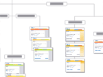
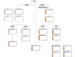
Next it was time to find an ideal layout for our "chrome" -- top- and second-level navigation. Many intermediate forms and outright rejects have been ommitted from this 10ft. x 3ft. Illustrator document, which mimicks the final layout of the printed pages on our design wall. Our key goal was to establish a natural and obvious visual hierarchy that would play into human subconscious learning patterns and enable users to truly feel where they are in the application and how to find their way to their next destination. Scalability for future feature expansion was also a major concern. |
 |
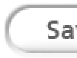
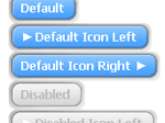
Enter: The button. I spent as much time as I could for about a week seeking out depressable controls in both digital and physical applications, looking for one motif that clearly stated, "push me and something will happen." Elevator buttons proved to be the most timeless and ubiquitous translation of this concept, and from their inspiration, I created this shape as guidance for the graphic designer. From here it grew into a more rectangular shape and picked up a blue color that users of the existing app were already trained to respond to. |
 |
A host of demo screen comps were built out and presented at a company all-hands meeting. After this came the development of XHTML Strict-compliant templates that were verified across all of our supported platforms, including the most difficult of all time, MSIE 5.17 for OS9. All existing HTML page mockups were then ported to the new template for handoff to engineering.
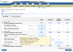
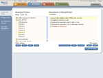
This is a sample of a very frequently-used page for organizing & browsing tests. |
 |
Existing users reported frequent difficulty determining where they were in the application IA. This redesign mockup screenshot shows how the field of visual influence of selected top-level tab bleeds all the way down the page. The tab's color is even teased in the background behind the feature you're working with.
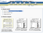
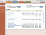
"Flex reports" was a new feature that allowed end users to generate & safe custom analytics. |
 |
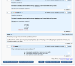
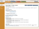
A sample of a flat document from yet another tab. |
 |
After the contract designer's term was up, I led a staff UI designer in a final effort to sharpen the button shape and improve contrast and definition. With her work complete, I created a single Javascript component that could render fully skinnable, HTML-based buttons in any of our defined styles and functionally emulate image, submit, reset, or generic form buttons, or links. Engineers were able to deploy this component without further modification. |
Candids
 |
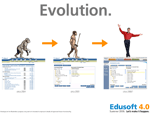
A bit of internal marketing to get people excited about the upcoming redesign. |
 |
More internal marketing. |
 |
When schedules are tight and resources are limited... |
< Back to Work samples
